

Skip to content
Back to our work

The work / A closer look

Verona Nails Bar

A Nail Salon Website That Lets the Photos and Reviews Shine

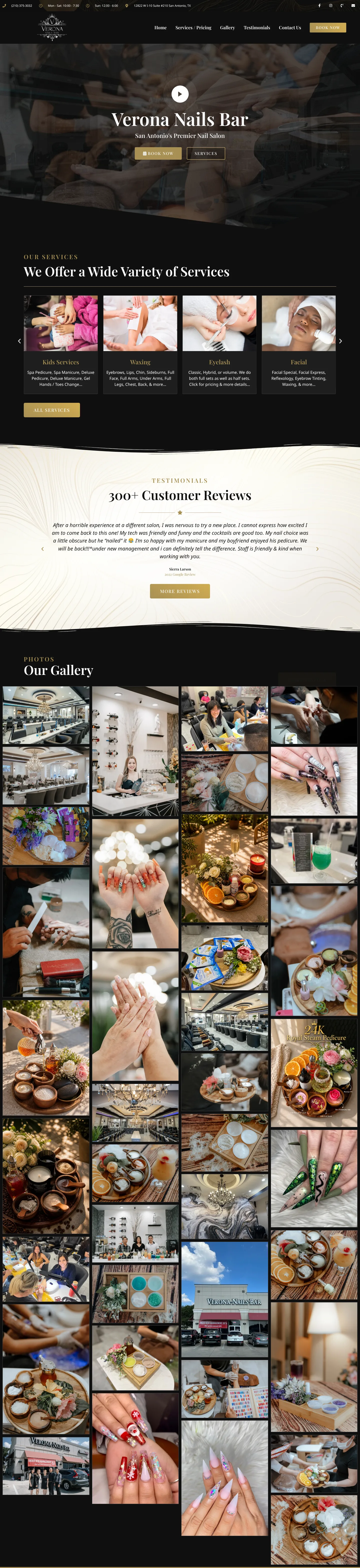
We created a straightforward website for Verona Nails Bar in San Antonio that puts its services, pricing, salon photography, customer reviews and location front and centre.

Based in

San Antonio, Texas

Launched

October 2022

Our role

Website design

Project website

veronanailsbar.com

Verona Nails Bar's website on desktop and mobile: the homepage with the salon's phone number, hours and address along the top, the Verona Nails Bar logo and menu, and a salon photo behind the San Antonio's Premier Nail Salon headline, beside the Gallery page on a phone with its photo filters.
The salon's phone number, hours and address sit at the top of every page, and the Gallery page, shown on a phone, sorts photos into location shots and nail design styles.

Verona Nails Bar in San Antonio, Texas, already had two things we love working with: beautiful photos and plenty of happy customers. For this project, the goal wasn’t to build something complicated. It was to give the salon a website that showed people the space, the work and everything they offered.

Everything Customers Need in One Place

We kept the website simple and easy to navigate. Visitors can explore the salon’s services, check pricing and the menu, and find the location, hours and contact details before stopping by.
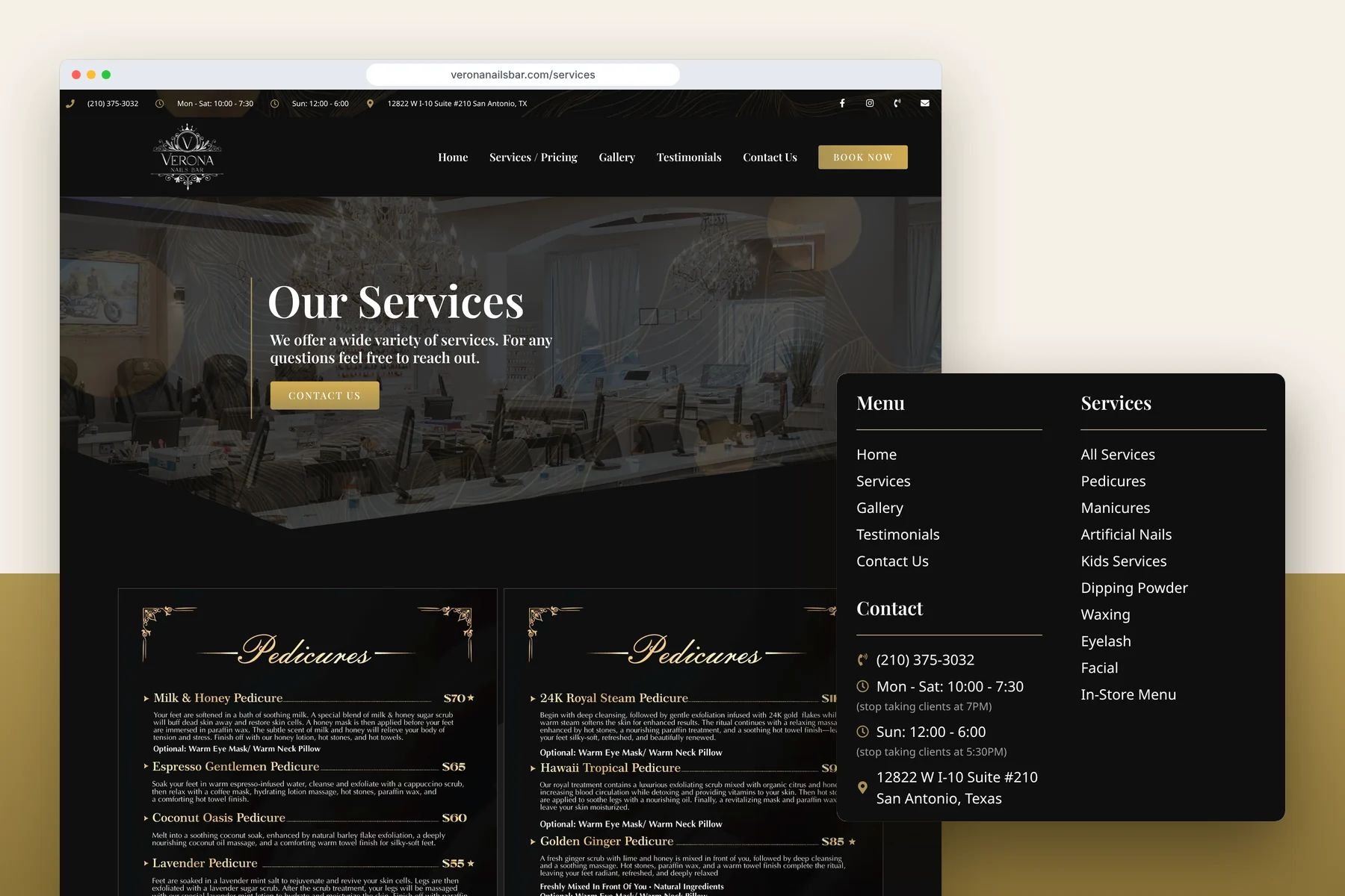
The Verona Nails Bar Services / Pricing page in a browser, with the phone number, opening hours and address in the top bar, the Our Services header and the salon's Pedicures menus listing each treatment and price, beside a close-up of the footer's Menu, Contact and Services columns with the phone number, Monday to Saturday and Sunday hours and the West I-10 address in San Antonio.
The Services / Pricing page sets out each treatment with its price, and the footer keeps the hours, address and phone number on every page.

The idea was to make it easy for someone who’s never visited Verona Nails Bar to get a good feel for the place.

Letting the Photos and Reviews Do the Talking

One of the nice things about this project was how much great content the salon already had.

The Verona Nails Bar Gallery page as a tall strip of photos, a large photo of the salon's interior with a crystal chandelier, pedicure chairs and manicure stations, and a close-up of the Our Gallery filters with Location Photos selected, showing photos of the salon, its storefront and people in the salon.
The gallery holds the salon’s own photos of the space and its nail designs, with filters for location photos, scrubs, 3D and jeweled nails, seasonal sets and more.

The photo gallery shows off the beautiful space along with all kinds of nail designs and treatments. And with hundreds of positive customer reviews, there was plenty of genuine feedback to share.
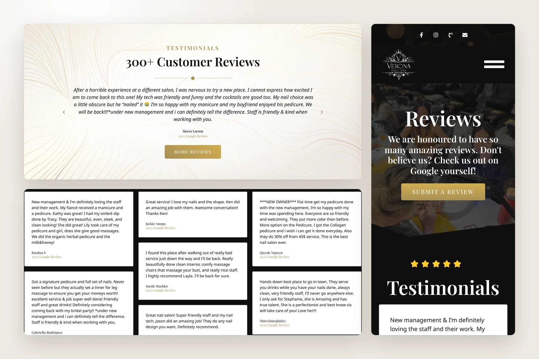
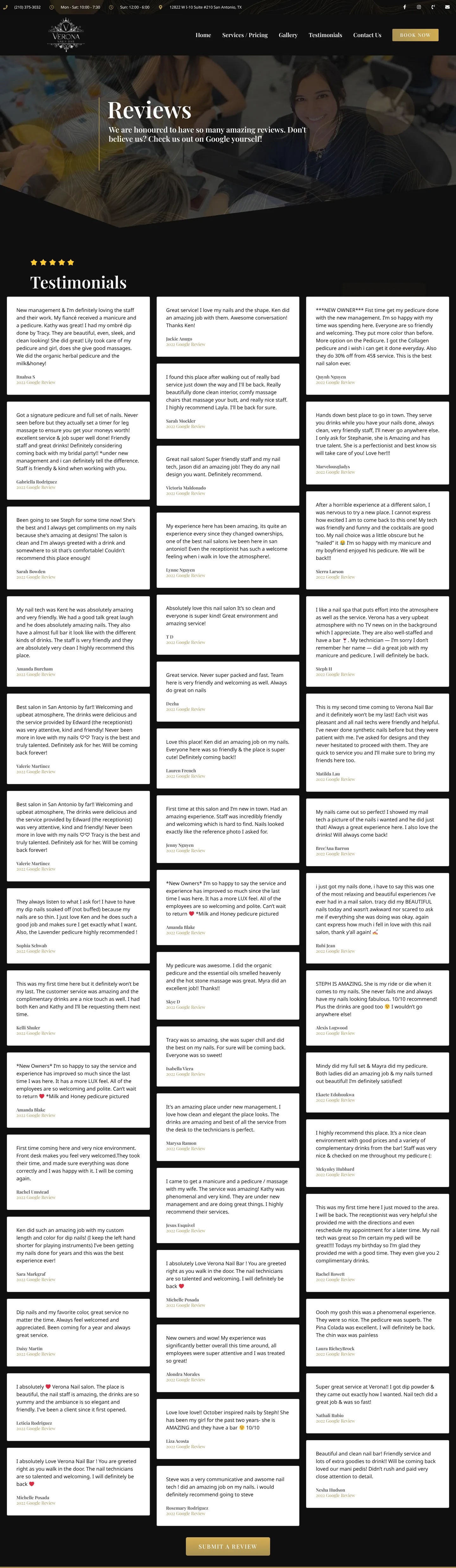
The homepage's Testimonials section headed 300+ Customer Reviews, with a review from Sierra Larson and a More Reviews button, above a wall of customer review cards from the Reviews page, beside the Reviews page on a phone with its Submit a Review button and five gold stars above the Testimonials heading.
Customer reviews appear on the homepage and fill a Reviews page of their own, on desktop and on a phone.

Rather than filling the website with a lot of extra content, we focused on showcasing what was already there.

It’s a straightforward website that lets the salon’s work and reputation speak for themselves.

Take a look at Verona Nails Bar.
Let's look at your bigger picture

Good design starts
with good questions.

Tell us about your project